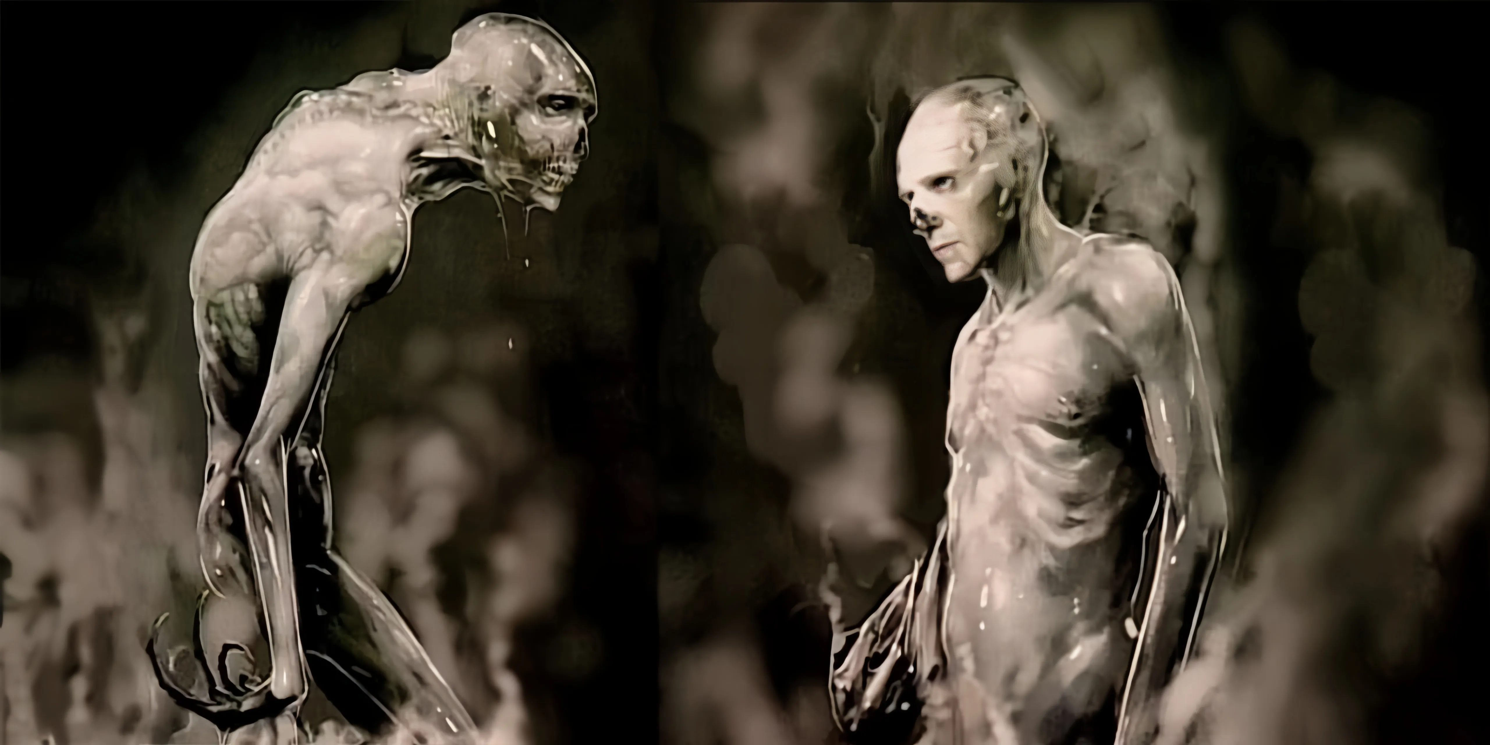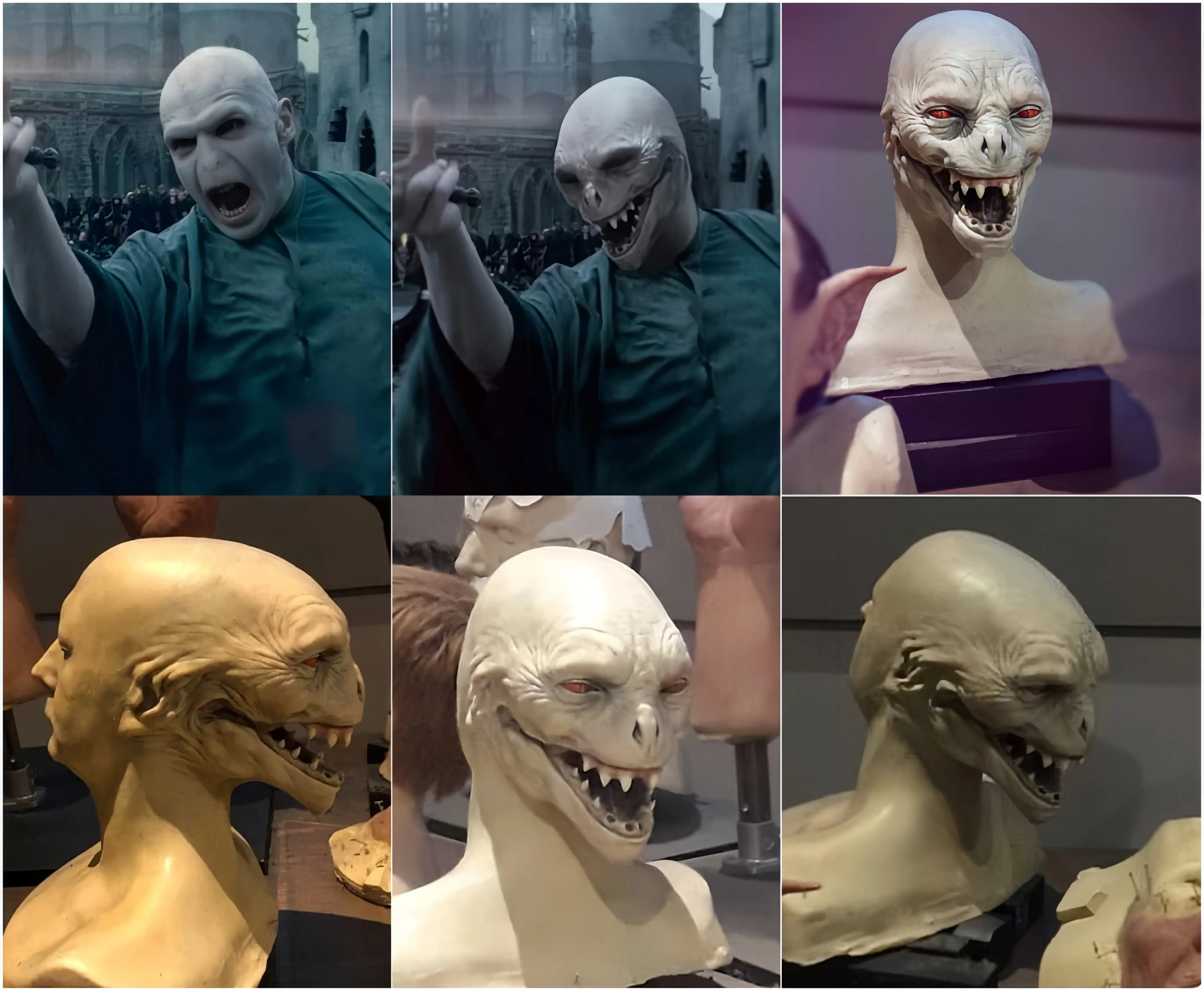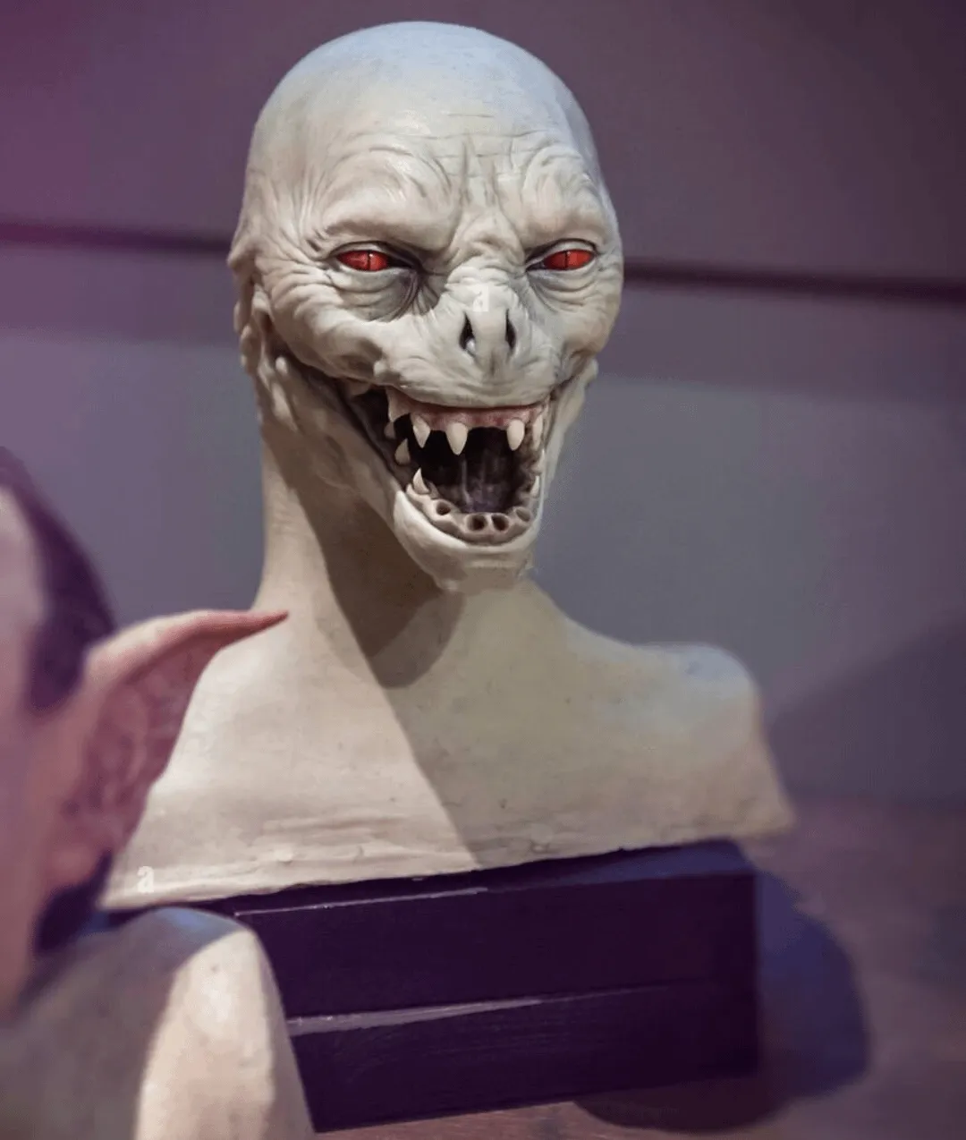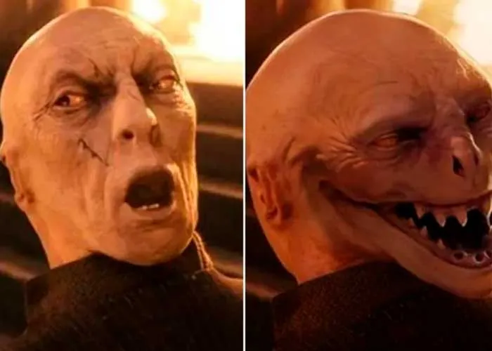
When J.K. Rowling’s Harry Potter series was adapted to the big screen, audiences were enchanted by magical spells, Hogwarts’ grandeur, and of course, the battle between good and evil. Central to this struggle was Voldemort, “He-Who-Must-Not-Be-Named,” a character whose pale, snake-like visage became iconic. However, what many fans don’t know is that an original design for the Dark Lord was considered too terrifying to see the light of day.
An Abandoned Design Too Terrifying for the Big Screen
The Voldemort we eventually saw in the Harry Potter films—played by Ralph Fiennes—was haunting enough, with his slit-like nostrils, white skin, and soulless eyes. However, early in the production phase, the creative team had experimented with a design even darker, more grotesque, and potentially nightmare-inducing. According to sources involved in the pre-production, this initial design was scrapped not for lack of artistic merit but due to concerns that it might traumatize younger viewers.
The design was said to push the boundaries of horror by leaning into body horror elements. Voldemort’s facial features were heavily disfigured, his skin appeared decomposed and peeling, and instead of subtle snake influences, the character exhibited more monstrous and reptilian traits. Early sketches suggested that his eyes would be sunken deep into his skull, surrounded by jagged cracks, and his mouth stretched unnaturally wide—creating a haunting, skeletal grin.
Protecting Young Audiences: The Film’s Dilemma
From the start, the producers knew they needed to strike a delicate balance. The Harry Potter films, while thrilling, were ultimately aimed at a family audience. Introducing a villain with a design bordering on horror movie standards risked alienating a significant portion of the film’s core demographic—children. Additionally, since Voldemort would appear across multiple films, the producers couldn’t risk creating a villain so terrifying that young fans would hesitate to return for future installments.
This decision aligns with how Hollywood frequently considers audience sensitivity, especially when producing films intended for a broad audience. Studios often need to moderate the amount of graphic content to secure ratings that will attract younger viewers without overwhelming them with fear.

The Influence of the Original Design That Almost Was
Even though the original Voldemort design was ultimately shelved, traces of its influence can still be seen in the final product. The eerie, lifeless quality of Voldemort’s appearance hints at the scarier version that could have been. In interviews, Ralph Fiennes mentioned how his performance drew on the idea of Voldemort being both inhuman and soulless, embodying a quiet, unsettling menace rather than a loud monstrosity.
Moreover, the evolution of Voldemort’s look throughout the film series subtly mirrors the increasing darkness in the storylines. In earlier films, Voldemort remains more shadowy and subdued, but by Harry Potter and the Deathly Hallows, his gaunt and decaying features have become fully apparent. This gradual transformation allowed the filmmakers to build fear over time, creating suspense and unease without overwhelming the audience right away.

The What-Ifs of Horror: Could a Scarier Voldemort Have Worked?
It’s intriguing to consider how audiences might have reacted if the original Voldemort design had made it into the films. While it’s likely that a more horrifying version of Voldemort would have amplified the menace of the character, it may also have alienated younger viewers—potentially even drawing criticism from parents and family-oriented audiences. Would Harry Potter have been as globally beloved if Voldemort had leaned too far into grotesque horror?
Film analysts suggest that keeping Voldemort’s appearance unsettling yet restrained was the right call. It allowed the focus to remain on the character’s actions and motivations rather than just his appearance. Ultimately, Voldemort’s menace lies not only in how he looks but in what he represents: the loss of humanity, the embrace of evil, and the dangers of immortality.

Horror Kept in Check for the Greater Good
The decision to tone down Voldemort’s appearance reveals the careful thought that went into the making of the Harry Potter films. It’s a reminder that sometimes, less is more—especially when crafting characters that must remain both menacing and accessible to a broad audience. While fans will always wonder what could have been, the Voldemort we know has already earned his place among the most memorable villains in film history.
This hidden story about the scrapped Voldemort design adds an intriguing layer to the Harry Potter legacy. It leaves us wondering—how scary is too scary for a children’s film? As filmmakers continue to navigate the fine line between captivating and terrifying, Voldemort’s evolution stands as a testament to the power of restraint in storytelling.